Data storytelling is no longer just a buzzword—it’s a tool that turns raw numbers into narratives. Whether you’re presenting business performance, analyzing social trends, or sharing a compelling research finding, the way you visualize your data can make or break your story. That’s where Flourish Studio comes in. I recently gave Flourish Studio a try, and it was awesome!
flourish.studio is an online platform for creating stunning, interactive visualizations without the need for coding skills. It’s designed for anyone who wants to make their data more engaging—journalists, analysts, marketers, or educators. The tool comes packed with a library of pre-designed templates, ranging from simple bar charts to complex scrollytelling visuals.
Flourish was acquired by Canva in 2022, bringing interactive data visualizations into Canva’s easy design platform.
The sign-up process was straightforward, and the interface felt intuitive from the get-go.
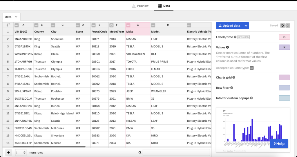
I used a dataset about electric vehicles, which I found on the Data.gov website here. The dataset has 216k rows of information like the make, model, year, and type of electric vehicles registered in different areas. It also includes details about the battery range and whether the vehicle is fully electric or a plug-in hybrid. The data is in a CSV file, making it easy to download and use in tools like Excel or Flourish for creating visualizations.

A new visualization in Flourish Studio changes how data is presented, like using a different chart or map. A new story combines multiple visualizations to share a deeper, more engaging insight from the data.
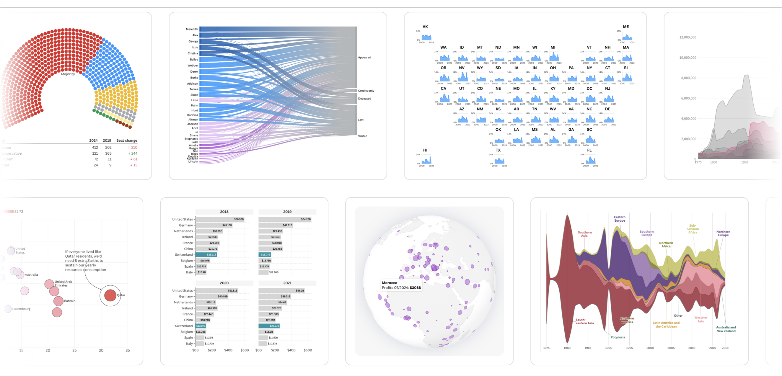
Flourish offers a wide range of charts and visualizations to suit different data storytelling needs. From simple bar charts and line graphs to more advanced options like scatter plots, treemaps, and stacked area charts, there’s something for every type of data. You can also find interactive visualizations like maps, bar chart races, and animated timelines, making it easy to create dynamic and engaging visuals. Whether you’re looking to showcase trends, compare categories, or highlight geographic data, Flourish has a versatile set of chart options to help you tell your data’s story effectively.
To upload data in Flourish Studio, simply start by selecting a template. Once you’re in the template editor, look for the “Data” tab. Here, you can either drag and drop your data file (CSV, Excel, or Google Sheets) or use the “Upload” button to select your file from your computer. Flourish will automatically map the columns in your data to the template’s fields, making it easy to visualize your data. If needed, you can adjust the data structure or format directly in the editor to ensure everything displays correctly.
I tried uploading a large dataset with ~216k rows, and I noticed that it caused some lag. The platform struggled a bit with such a large volume of data, making the editing process slower. As the platform was too laggy, I decided to delete the visualization and reduced the dataset to 10k rows to test out the app more smoothly.
After successfully uploading the data, I tried a few bar charts to test things out. I was impressed by the number of customization options available, including themes, backgrounds, popup panels, and the ability to add header and footer text along with notes. Everything was straightforward and simple to use. These tools made it easy to create high-quality, publisher-ready charts. However, it was a bit laggy while adjusting the customizations, as changes were reflected in real-time on the canvas. This caused some delay, especially when making multiple adjustments at once.
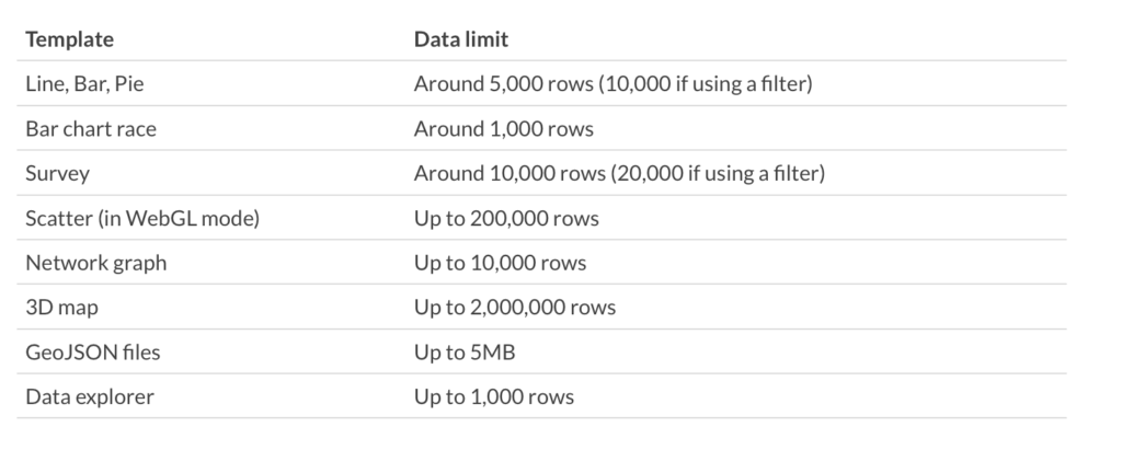
Every Flourish template is unique, each with its own quirks and limitations, especially when it comes to the amount of data it can handle. Understanding these limits is crucial, especially in situations where:
– You’re building a visualization and need to check how much data is too much.
– Your visualization is taking too long to load or is even crashing.
Here’s a rough summary of how much data some of the Flourish templates can handle:

Keep in mind that these are general guidelines, and your experience may vary based on the specific complexity of your data and the template you’re using. To get the best performance, it’s always a good idea to optimize your dataset before uploading, especially if you’re working with larger amounts of data.
In the data panel, the options for transformation were somewhat limited. It’s best to upload a transformed and ready-to-use file. While you can change data types, adjust input formats, add or delete columns, and unpivot/combine them, the available options for on-the-go transformations are not as extensive as I expected. so, it’s best to upload a dataset that’s already prepped and ready to go.

Overall, my experience with Flourish Studio was a bit of a mixed bag. On the one hand, it’s an easy-to-use, drag-and-drop tool that makes creating stunning, interactive visualizations a breeze. Whether you’re adding custom themes, tweaking backgrounds, or editing headers and footers, everything is straightforward. If you’re into data journalism or need to create high-quality, publisher-ready charts quickly, Flourish has you covered.
That said, I did hit a few bumps along the way. When I tried uploading a large dataset, things started to slow down significantly. It became clear that Flourish isn’t built for handling heavy datasets. The real-time canvas updates are a double-edged sword—they’re useful for seeing changes instantly, but they can make the tool lag when you’re fiddling with multiple customizations at once.
I believe that Flourish has so many features I haven’t even scratched the surface of. There are interactive slideshows, map visualizations, bar chart races, and a ton of ways to tell data-driven stories. Plus, the customization options—like animations and custom color schemes—give you a lot of creative freedom.
Despite the few hiccups, I’d still recommend Flourish for smaller datasets and for anyone needing to create engaging, high-quality charts quickly. While it’s not the best tool for handling large amounts of data, it’s perfect for telling stories with data in a visually compelling way.
